I probably worry too much about graphs and data analysis but I came across a graph on twitter this morning that grabbed my attention. I don’t know the person who posted the graph or what they were thinking but it struck me as wrong in one or two areas so I set about correcting the errors. That’s what this page is about!
The Graph
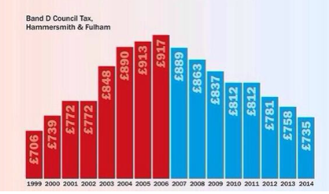
Here is the graph from twitter: @gstokey posted it. Council Tax is a UK local government tax levied on properties in particular government districts. Band D is one category of property: there are also Band A, Band B etc. A tax of £900 means the property owner or occupier has to pay £900 a year to the local government district in which the property sits. In return the property owner/occupier is entitled to receive services such as rubbish removal, schools and so on.
Here is the graph from twitter:
There is no source given for the data in the graph so I cannot check them but the major problem with it is that they have broken the vertical axis without declaring it: that warps our view of the data. The red series denotes Labour control of Hammersmith and Fulham Council and the blue series denoted Conservative (Tory) control of the council. It doesn’t say that but that is the convention in the UK for the main political parties: red v blue!
Otherwise, the graph is clear and by adding data labels I was able to replicate the data series and prepare my own table and graphs of the data.
Drawing Red and Blue
In my post of yesterday I talked about conditionally colouring data series in graphs and I have talked about them before. Just take a look at what I did to the data series and then my analysis of it before we look at my graphs.
The Data and their Analysis
I copied the data series from the twitter graph and then split them according to whether they are red or blue: essentially creating two series from the one series. Plot the year and the two columns for Labour £ and Tory £ and we get this:
I created that 2D column graph of the data and it looks fine. Notice, the vertical scale is no longer broken and the overall effect is quite different from the twitter version. The changes to the council tax payable is not so striking.
Now, then, I felt the need to explore the changes that I think the tweeter was aiming at so I drew this graph from columns D and E of my data analysis:
There is some drama in the changes imposed on the council tax, most notably for 2002 to 2003, which saw an almost 10% increase. Every year apart from one, Labour increased the council tax charge for Band D properties. Other increases were relatively modest by comparison. Until, that is, the Tories got into power when in every year except one they reduced the council tax charge for a Band D property.
I then thought about the cumulative impact of the changes over the period 1999 – 2014 and created the graph based on the cumulative changes from columns F and G:
Clearly, the cumulative impact reflects the annual impacts very well.
Overall, what did I do with my graph and what can we conclude? I prepared the following summary graph that I would like to see as a replacement for the twitter graph:
What I have done here is to show the total council tax charge for the Band D property using XY Scatter Icons under the names Labour £ and Tory £ and then shown the cumulative changes as 2D Columns over the period, colour coded red and blue according to the political affiliation of the council at the time.
I offer this as an alternative and I would be delighted to receive comments and alternative presentations for further discussion and inclusion here.
Download my file from council_tax_analysis
Duncan Williamson


